
Making text accessible is about more than just using plain language; it’s also about making sure that everyone, including disabled readers, neurodivergent readers and other readers with distinct needs, can make sense of text on a website or screen. In this blog post, Andrew Macdonald Powney suggests some simple ways we can make our text more accessible, whatever its published format.
Four simple ways to make text more accessible
There are many ways that text can be made more accessible (too many for this blog post). Here are four of the easiest and most impactful ways to get started. To learn more, delve into plain language principles (for example through the CIEP’s course Plain English for Editors), or investigate web accessibility (for example by learning about the Web Content Accessibility Guidelines).
Styling headings
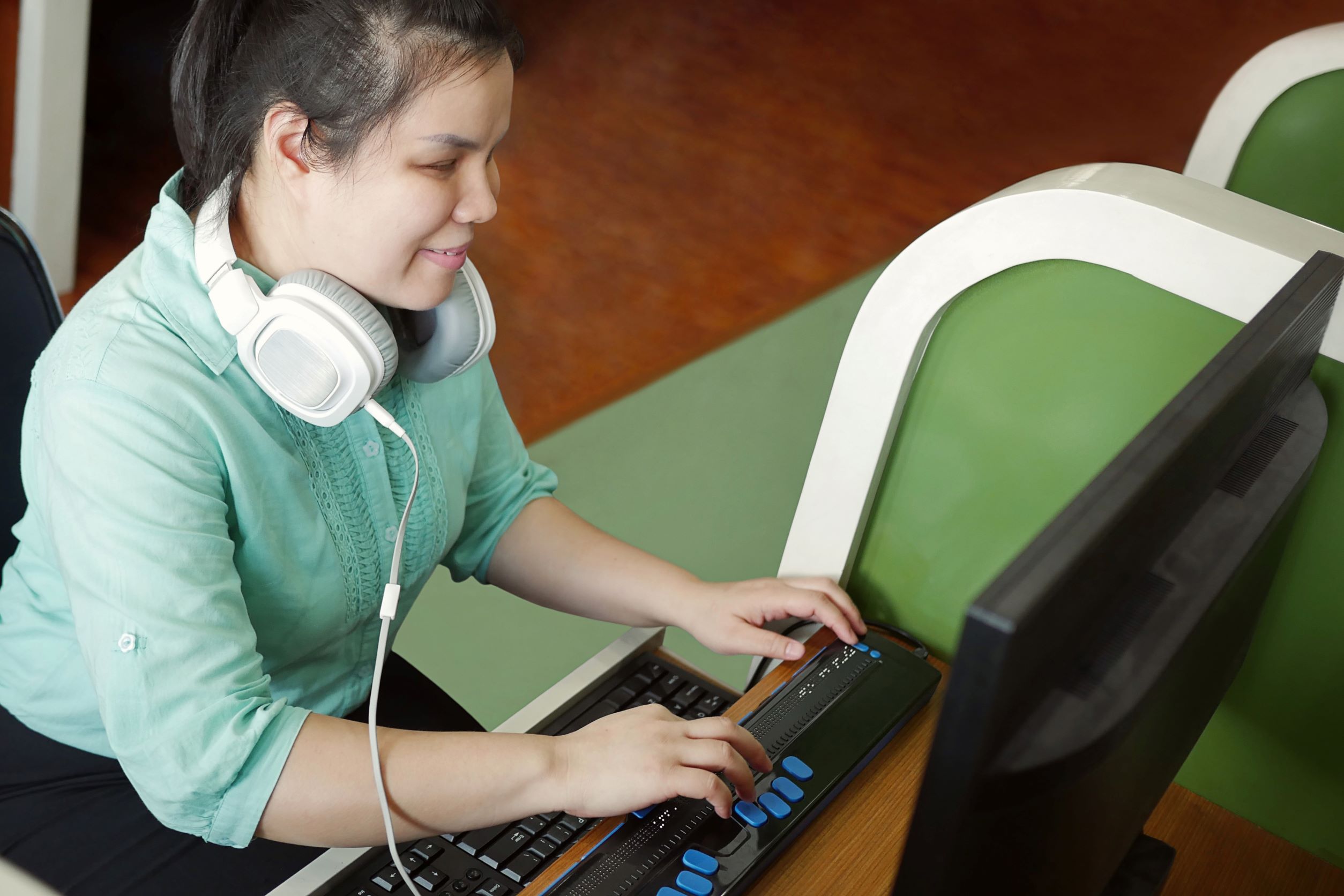
In Word, an editor can make some text look like a heading by increasing the font size and putting it in bold. But a screenreader (software that reads out text on a computer screen, often used by blind or visually impaired people) cannot interpret that. Screenreaders need an unseen ‘tag’ or phrase of code which states that the following words are going to be a heading: they need the editor to style the text as a heading.
When you apply a heading ‘style’ in Word to what already looks like a heading on your screen, Word creates the code tags for you. All future readers will be told it is a heading. Meanwhile, at the editor’s end, the visual formatting to go with that ‘style’ has to be modified just once, and the change will be made to every piece of text to which the style has been applied.
These tags of code allow the screenreader to navigate from heading to heading, and they let the screenreader explain to their human reader that a title is coming.
Shorter and simpler sentences
Short sentences, front-loaded content, active voice: all good advice for writers, and good, too, for the users of screenreaders. A person can change the speed at which the screenreader speaks, but it is still easiest to digest a sentence when the subject and key point come first. And shorter sentences are simpler to hear.
Another advantage of short, direct sentences is that they tend to fit inside a line length. This reduces the chance of a line break mid-sentence – especially if you left-align, as you should for accessibility. Therefore short sentences work across a range of screens and devices. Reading a longer sentence on a narrow screen requires dexterity, concentration, and good vision that not everyone will have. Not everyone can zoom in and out, or scroll back and forth, and still keep track.
Writers and editors may forget that reading itself cannot be taken for granted. The conditions that make it hard to remember what you read – everything from cognitive processing issues to simple tiredness – make complex sentences more of a risk. When the very act of reading takes some effort, no more obstacles need be added.
Fonts and formatting
As a general rule, the fewer serifs in a font, the better. Sans serif fonts like Calibri and Arial do a better job of keeping letters distinct. There is less danger of overlap in the ascenders and descenders of adjacent letters. People read by pattern recognition, and when the patterns are easier to spot (because the individual letters are clearer), the text is easier to read.
Regardless of which font you use, don’t create constant mental adjustments with phrases in bold, words in italics and underlines. Displayed quotations, for example, are already pulled out; putting them in italics is an extra cognitive burden.
Alt text
Alt text is text which is an alternative to the image on the page. It is commonly used to stand in for images that visually impaired people can’t see; the sighted reader sees the image, while the screenreader reads out the alt text.
Alt text image descriptions need to be short; if there is too much to say, additional text next to the image would be better. Having said that, alt text still needs to provide useful information. The editor crafting alt text needs to think: what does the author need the reader to take away from this image, which this reader cannot see? ‘Picture of a graph of temperatures’ tells that reader nothing; ‘graph showing that temperature peaked in July at 31°C’ conveys information.
Remember that text may be repurposed
If you usually work on text that is going to finish up as a printed, physical object, then it may seem like certain aspects of accessibility are irrelevant – styling headings to aid screenreaders, for example, or using short sentences to reduce line breaks on narrow screens.
But this text could be repurposed at some point in the future. What you prepare for one format now may need to be repackaged for another medium, on another day. This is something worth bearing in mind when editing any text: can it be edited to ensure accessibility across different mediums? This could help to future-proof the text against whatever else your client may decide to do with it.
About Andrew Macdonald Powney
Andrew Macdonald Powney is an Intermediate Member of the CIEP and the content and quality team leader for APS Group (Scotland).
 About the CIEP
The Chartered Institute of Editing and Proofreading (CIEP) is a non-profit body promoting excellence in English language editing. We set and demonstrate editorial standards, and we are a community, training hub and support network for editorial professionals – the people who work to make text accurate, clear and fit for purpose.
Find out more about:
Photo credits: keyboard letters by Pixabay on Pexels, blind person using a computer by Chansom Pantip on Shutterstock.
Posted by Harriet Power, CIEP information commissioning editor.
The views expressed here do not necessarily reflect those of the CIEP.
This is a really excellent article, Andrew – and one that practises what it preaches in being succinct, clear and enjoyable to read! Well done! May I please share this on my LinkedIn page? Obviously, I’d fully credit both you and the CIEP when doing so. I know there are options to share it, and it has been already published by the CIEP at this stage, but just sharing without asking permission seems to me, well, rude!
Many thanks,
Julie Hopkins-O’Keeffe
OneStop Editorial Services Ltd
(Writing on behalf of the CIEP info team) Yes, please do feel free to share! As long as it’s clear who wrote the post and where it was first published, the more shares the better 🙂
Harriet
What a wonderful succinct article. Thank you.
Also thanks to Julie for asking the question about sharing. Thanks to Harriet for saying it’s OK to share – I’ll do the same.
Peter