Tag Archives: typesetting

Reflections on the self-publishing process

Three CIEP members, Kia Thomas, Judith Leask and Eleanor Abraham, reflect on the self-publishing process from their perspectives as author, editor and typesetter.

Kia: the author

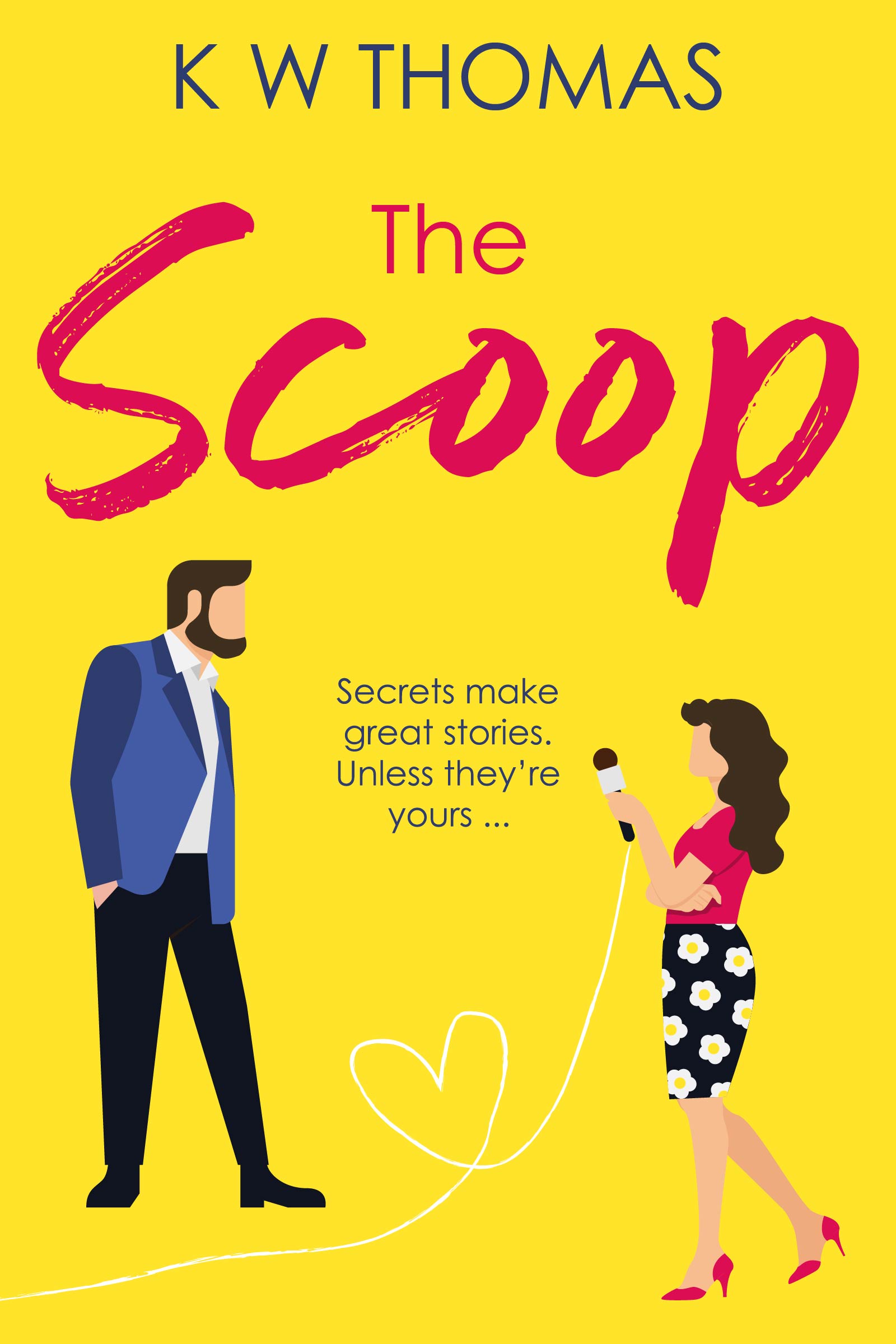
I self-published my first full-length novel, a contemporary romance called The Scoop, in July 2022. I always knew I’d hire a professional editor before I published it (practise what you preach and all that), and I always knew I’d start my search within the CIEP, whose members have been as wonderfully supportive of my publishing journey as they’ve been on my editing one.

Finding the right editor

It was important to me to find not just a good editor, but the right one for me. I wanted someone I could trust, someone who was fun to work with, someone who could work with me the way I am – as an editor, I’m generally quite hands-on, and I work best with people who are willing to put their trust in what can sometimes be a lot of intervention. But I’m not that kind of author – I’m the absolute pain in the backside who’s extremely precious about every last one of her woThe Scoop book coverrds. (One of my notes to my editor was ‘You can prise my adverbs out of my extremely cold, absolutely dead hands.’)
I began by asking CIEP members who were looking for more experience in fiction to put themselves forward for the job. Fiction editing is very competitive, and various CIEP members have helped me find opportunities over the years, so I wanted to offer that chance to someone else. I asked each candidate to complete a sample edit. There are often debates in editorial circles about whether they’re a good idea or not, and whether editors should offer them for free or not, but I know that I wouldn’t have been able to hire someone without seeing their work, as every editor is so different.

And this was proved by the ways in which each editor approached the text. No two samples were exactly the same – everyone picked up on slightly different things, and had different solutions for the problems they identified. That said, every single editor did point out one ambiguous passage that was totally clear in my mind, and it hadn’t occurred to me until then that it could be read differently. It just goes to show why external editing is so important, for everyone; I might be a professional editor, but I’m still the author who can’t see the story from that objective angle, because I’ll always know what I meant!

I found some great editors through this process, and in the end, I chose to work with Judith Leask. Her sample showed me that she had a really sharp eye, which is obviously important, and she could work with my ideal timeframe and budget. And, just as importantly, her queries had a warm, friendly tone, which was exactly what I was looking for in my relationship with my editor.

The editing process

The edit itself was great – Judith picked up on so many little quirks I didn’t know I had. It was a really (one of my quirks is that I am far too in love with this word, I’ve discovered) positive experience, and at the same time humbling – being edited definitely makes me a more empathetic editor. She did a great job and made so many suggestions that made my story better, but at the same time always respected that the final decisions were mine to make. (I did end up ignoring many of her perfectly valid suggestions – like I said, I’m precious!)

Working with a typesetter

Once my manuscript had been copyedited, it was time to prepare it for publication. I’d worked with Eleanor Abraham before on A Very Sweary Dictionary, so working with her again was an easy decision. Design was more important for the dictionary, but even though a novel’s requirements are much simpler, I still wanted a high-quality interior. I’m a total pain when it comes to anything visual because I only know what I don’t want, but Eleanor was endlessly patient and happy to tweak things until I was satisfied.

I’m so happy with the finished book – it’s a polished, professional product that I’m proud to be sharing with the world.

Woman working on a laptop

Judith: the editor

Being chosen by Kia to edit her novel was very exciting, because I knew I’d learn a huge amount from her, and that turned out to be true.

I’ve never minded being asked to do a sample edit, as it’s part of the process for both parties to get to know one another, and it can help with producing an estimate of timing and costs. I see it as an opportunity to show how I’ll be able to add value to the author’s work, and hopefully that I’ll be reasonable and friendly at the same time. I want the author to feel reassured that they’ll keep control of their work. I’m so glad Kia’s response was so warm and encouraging.

It was both easy and hard to work with an Advanced Professional Member (APM) of the CIEP – easy, because Kia knew exactly how she wanted the process to work; and hard, because it was sometimes difficult to find anything to edit! But I really appreciated that Kia had already made some style choices that I could add to my style sheet before getting started, and she let me know when she’d prefer a query without an edit, and where it would be OK to dive in (potentially with a comment). I wouldn’t expect an inexperienced author to be able to give those instructions, but I’d make sure they knew they’d retain control.

Keeping the author’s voice

I was happy to accommodate Kia’s love of adverbs (I might have worked on a few of the instances of ‘really’!). Her use of adverbs just seemed to work for her characters’ voices and for her close narrator’s voice, giving them a fun, informal and modern feel. I didn’t feel the need to suggest a more interesting use of vocabulary, which I sometimes do when I see adverbs. And this point illustrates what I love about editing – it feels like part of the creative process and an accomplished craft. It navigates various factors and focuses on working with the author to make the work consistent and right for their style and intended audience, while keeping an eye on the conventions (there are far fewer rules than you might think).

In some places, my main input to Kia’s book was to consider repetition of words or sentence structures. I made suggestions for alternative words or phrasing, and for some Kia gently gave feedback that she didn’t feel they were in keeping with her voice. I’m completely happy with what she describes as a controlling approach, because I’m always clear that all decisions ultimately lie with the author. We had a laugh about one or two of the repeated words in certain, ahem, intimate scenes. I’ll leave it to your imagination which words those might have been!

Making conscious choices

I also kept in mind the need for sensitivity and conscious language choices, but (as you might expect from a professional editor) Kia had written with these things in mind. I made one comment relating to the female character’s safety, but Kia decided the plot wouldn’t allow a different choice, which was a completely understandable decision. I’d done my job, though, in making sure an author is making their choices consciously.

Where Kia decided she didn’t want to go with a suggestion of mine, just because her wording felt right to her, I quite understood. I know what that’s like, and I don’t take it as a snub. I’d make a comment to an author if I felt there was a risk in their choice, but that didn’t apply here, and authors are free to disagree if they wish.

I have to say I haven’t had a bad experience working with an independent author. I’ve always found authors to be open to the input from a professional editor and happy to see what a fresh pair of eyes will spot.

I think Kia’s book will be successful, because she’s written a truly entertaining novel that just about anyone would enjoy. If she’d told me to stop work after a few chapters, I’d have bought the book and read the rest anyway.

wooden typesetting blocks

Eleanor: the typesetter

Kia seems to think she was difficult, but I didn’t think that. She made it clear she likes things plain and simple. That’s sometimes all the brief you’re going to get from a client. I find that preferable to receiving a brief that is very prescriptive. Sometimes if people have really specific requests, maybe without understanding the repercussions of those, it can result in some time-consuming discussions. I suggested a few fancier features to her, knowing she’d likely say no, but it was useful to see what she considered to be plain enough. Rather than her being picky, I thought she was quite pragmatic about accepting advice when it mattered.

Working as a team

A pragmatic and professional attitude is common with the indie writers and publishers I work with as an editor and typesetter. I enjoy working with people who have clear goals for their books, brand and business. They take selling books seriously and consider the publishing professionals working with them as an essential part of the team, rather than an expensive extra.

Self-publishing can be an overwhelming process. For some writers, it makes sense to outsource certain tasks so they can concentrate on the creative stuff … and on the sales and marketing, which are going to take up lots of time and effort.

Typesetting, like proofreading, is a process that people often assume is quite easy and for that reason they might choose to do it themselves. Making print attractive and readable, while conforming to the conventions that make it printable, is, like most things, trickier than it looks. But then, I would say that.

The typesetting process

For Kia’s layout I imported her edited Word file into Adobe InDesign. In my opinion, it’s the best tool for the job. Cheaper alternatives have just eaten up my time working around their limitations. I can control and automate a lot of InDesign’s layout settings (running heads, hyphenation, word breaks, styles, kerning, table of contents etc) but I do what I call a quality control (QC) check too. If no further proofreading is going to take place (and these days that stage has usually been carried out in Word), this QC check is the equivalent of the layout checks a proofreader would do (checking that the way the text appears on the page is attractive, balanced and as it should be).

Although my settings choices took care of ‘widows and orphans’ (short lines or single words that end up at the top or bottom of a page), and kept bad breaks to a minimum, my own clearly prudish settings kicked in one time to prevent the first word on a page being ‘nipples’.

After typesetting, I sent Kia a PDF proof and she marked up any final changes she wanted with Acrobat commenting tools. With final corrections done, we exported an ePub from the InDesign file. Other ebook formatters may work in a different way but that’s the workflow and software that I prefer.

Working with another CIEP editor was a great experience. We trust each other and speak the same publishing language, and no doubt this contributed to the process going fairly smoothly. It also helps when you find people to work with who are good-humoured and pleasant!

Kia

Working with such helpful, friendly professionals was an important and really positive part of my self-publishing journey. It cost money, true, and I may never make that back (because I’m terrible at marketing), but my writing is absolutely worth investing in. I’m looking forward to working with my fantastic little team again for book 2!

About Kia Thomas

Kia ThomasKia Thomas is an Advanced Professional Member of the CIEP who works primarily with independent authors, specialising in contemporary romance. She is also the author of A Very Sweary Dictionary, a style guide for bad language; Wings, a literary fiction novelette; and, as KW Thomas, The Scoop, a contemporary romance novel.

About Judith Leask

Judith LeaskJudith Leask came to freelance editing following eight years of honing her skills in creative writing, and twenty years’ writing experience in the business and public sectors. Now a passionate copyeditor and developmental editor for fiction and narrative non-fiction, she is an Intermediate Member of the CIEP.

About Eleanor Abraham

Eleanor AbrahamEleanor Abraham has been an editor and typesetter for a long time and remembers having to look stuff up in encyclopaedias, paste up camera-ready-copy and send faxes. She will bore you about typography at the drop of a descender. Her published written words can be found in Meowditation, Maw Broon’s Cookbook, Maw Broon’s But an’ Ben Cookbook and Maw Broon’s Afternoon Tea Book. She is an unapologetic generalist – from computer science to memoir – but loves a cosy whodunnit on a rainy afternoon.

 

About the CIEP

The Chartered Institute of Editing and Proofreading (CIEP) is a non-profit body promoting excellence in English language editing. We set and demonstrate editorial standards, and we are a community, training hub and support network for editorial professionals – the people who work to make text accurate, clear and fit for purpose.

Find out more about:


Photo credits: header image by Ciao on Pexels, woman working on a laptop by Teona Swift on Pexels, wooden typesetting blocks by Raphael Schaller on Unsplash.

Posted by Eleanor Smith, blog assistant.

The views expressed here do not necessarily reflect those of the CIEP.

Preparing text for typesetters and designers

What’s the difference between a typesetter and a designer, and why does it matter? How should copyeditors prepare text for typesetting? In this post, Rich Cutler gives us a brief introduction to the world of typesetting and design.

The first thing to realise is that copyediting is a game of two halves: editing the content (language, style, fact-checking, consistency …) and preparing the copy for the publication process. Although modern copyediting has changed significantly this century, the latter task (copy preparation) remains vital for most published texts.

Second, copyeditors need to know that a typesetter and a designer are different beasts: ‘typesetter’ and ‘designer’ are not synonyms, though some designers can typeset, and some typesetters can design. The copyeditor should ask their client whether the copy will be going to a designer or a typesetter.

It helps to know the background and evolution of typesetting and design when preparing copy. The two professions are often lumped together but in actuality are very distinct and require different approaches by copyeditors.

A brief history of typesetting

The origins of typesetting lie in printing. Gutenberg’s printing press revolutionised book making in the 15th century by its use of movable and replaceable metal type, which allowed books for the first time to be made quickly and as multiple copies – previously, books were mostly painstakingly handwritten. Early printing houses employed people who arranged or ‘set’ these individual metal characters as words, lines, paragraphs and, finally, pages, ready to print on sheets of paper: these were compositors, later called typesetters.

Typesetting centres on two key principles: aesthetics and readability. A typesetter will arrange text and displayed material (such as illustrations and tables) on a page so that the eye is led naturally from one idea to the next, making sure that the context is conveyed at a glance through careful placement of the elements on a page (eg headings and line and paragraph breaks).

Typesetters are problem-solvers. The ideal layout is not always possible – the perfect placement of, say, an illustration in relation to the design and the sense of the text may result in unacceptable positioning of subsequent material – so compromises are needed to achieve a balance between readability and aesthetics. Authors, clients and proofreaders may grumble about the less-than-ideal location of a figure, but an experienced typesetter will have sound reasons for its placement.

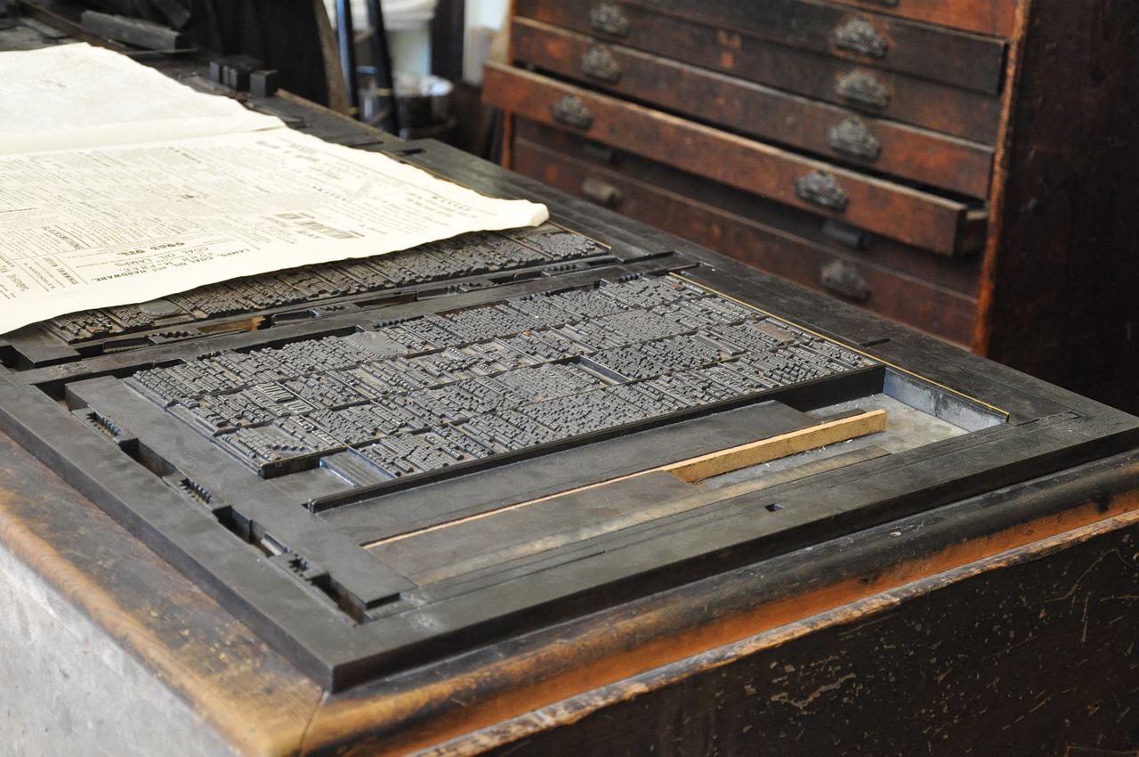
Typesetting has always been a highly technical profession. During Gutenberg’s time and into the 20th century, pages were composed as mirror images of the printed pages by placing metal type with reversed characters in backwards order into a frame. Hot metal typesetting was replaced by a photographic technique – phototypesetting – in the mid-20th century, and a record of the text composed by the typesetter was stored as perforated paper tape. Typesetters were so skilful that they could interpret the patterns of punched holes in the tape as typographical characters and layout. Phototypesetting machines in the 1970s replaced this paper record with magnetic tape, but were yet to have screens allowing the typesetter to see what they were composing.

Preparing copy for a typesetter

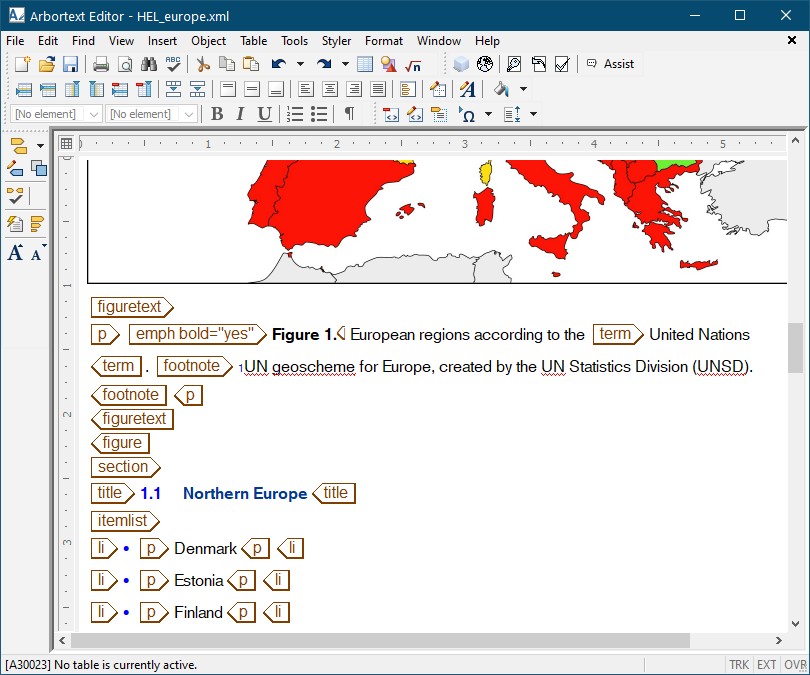
Today, typesetting, like many professions, is done using computers and specialist typesetting software costing several thousands of pounds (the best known being Arbortext). The historically highly technical nature of typesetting is visible in Arbortext and its ilk, which focus on showing the operator the content of a page on screen rather than its actual appearance (see the screenshot) – headings, paragraphs, lists, etc, have arbitrary styles that simply differentiate these items from each other and bear no relationship to how they will appear in print (not unlike Microsoft Word in the early 1980s – before Windows existed!). All text items are assigned tags in a computer language (typically XML) that defines what the elements are – and a master definition file dictates what should be done with these elements, such as their appearance in print and online (which may differ), and whether certain elements are to be hidden in some versions (eg for particular markets).

Typesetters are therefore very computer literate, and are familiar with Microsoft Word, computer code, styles, tags, macros and so on.

So, if a copyeditor provides a typesetter with tagged text, a Word file using styles or even a Word file using local formatting rather than styles, the typesetter should have no difficulty producing proofs with the required layout and appearance.

If the copyeditor wants to make the typesetter very happy – and to reduce proof errors – the copyeditor should

  • remove all unwanted formatting and styles that have been applied to the text
  • use a tagging or styles scheme only (or perhaps a combination) to indicate appearance
  • provide a key to their scheme.

Additionally, the copyeditor should flag anything out of the ordinary or requiring a specific layout or appearance (unusual characters, alignment and indents in, say, a poem, illustrations that must appear together, etc). Using local formatting to indicate the appearance and layout of text for typesetting is not ideal because this unsystematic approach can be ambiguous and unclear.

How designers differ from typesetters

Adobe InDesign hasn’t yet been mentioned. It is a graphic design program, not a typesetting program. Although it can be used for typesetting, it is slow and inefficient compared with dedicated typesetting software like Arbortext. InDesign is aimed primarily at graphic designers: in particular, a breed of designer that appeared alongside phototypesetting.

A phototypesetting machine produced photographic paper with an image of text. This could be an entire laid-out page, which was used to make a printing plate. However, the pages of complex publications like magazines or newspapers were easier to create by typesetting blocks of unlaid text, cutting up this text and gluing it (along with illustrations) to a sheet of card. These hand-made pages were then sent to the printer. Graphic designers who did this job were called paste-up artists: they were skilled designers, but did not have the technical focus on type that defined typesetters.

The widespread adoption of computers in the 1980s led to the appearance of desktop publishing (DTP) software aimed at graphic designers working in publishing. DTP software was affordable and easy to use compared with typesetting software, and allowed designers to typeset publications themselves for the first time. The best-known DTP program today is Adobe InDesign.

DTP changed commercial typesetting forever – and divided typesetters into camps:

  • those whose lineage is printing
  • those with a graphic design background.

To better understand how designers approach page layout compared with typesetters, we need to know a bit about DTP programs: they are the digital equivalent of paste-up – text and illustrations are placed in frames, which can be resized and moved about a page; also, a page will print exactly the same as it appears on screen (not unlike today’s Microsoft Word). A designer’s focus is primarily on aesthetics and appearance, and not so much on the structure and function of text like a typesetter. Most designers therefore have a less technical approach to typesetting, and may not use or understand tags or Word styles – many prefer to copy and paste text into InDesign, to deliberately lose all styles and formatting, then manually reapply styles and formatting in InDesign.

All typesetters work in a similar way, but the same cannot be said for designers: the copyeditor needs to find out how the designer wants text prepared. Some designers may be happy with a tagging or styles scheme, others prefer to copy and paste and then manually apply formatting. Some designers doing the latter may be efficient at spotting and transferring formatting, others may be more hit and miss, so highlighting formatting such as italics and superscripts for them can help.

About Rich Cutler

Rich Cutler began in publishing as a desk editor for STM publishers – first at Pergamon Press, then Harcourt Brace Jovanovich. He later became a freelancer and co-owner of Helius – a business that has been providing bespoke services to publishers for three decades, including development editing, copyediting, proofreading, project management, illustration, graphic design and typesetting. Rich is an Advanced Professional Member of the CIEP. He is also an occasional lexicographer, and helped to write the Collins English Dictionary and the Oxford Dictionary for Scientific Writers and Editors.


About the CIEP

The Chartered Institute of Editing and Proofreading (CIEP) is a non-profit body promoting excellence in English language editing. We set and demonstrate editorial standards, and we are a community, training hub and support network for editorial professionals – the people who work to make text accurate, clear and fit for purpose.

Find out more about:


Photo credits: letters by Jirreaux, printing press by Mari77, both on Pixabay, Arbortext by Rich Cutler.

Posted by Harriet Power, CIEP information commissioning editor.

The views expressed here do not necessarily reflect those of the CIEP.
A week in the life of a typesetter

By Andrew Chapman

I’ll have to begin with a disclaimer: a lot of each ‘week in my life’ is currently spent as a (very) amateur home-based teacher of my two children, something I’m sure many CIEP members in the middle years of life can relate to; so this blog post instead reflects some of the variety of my work. ‘Typesetting in times of change’, perhaps!

A flexible approach

It was luck that brought me to my slightly unusual career, mixing editorial and writing work with the design side of publishing. Early in my career, I got a job as a staff writer on a computer magazine – remember the Amstrad PCW word processors? That technology was already obsolescent in the mid-1990s, but in a sense this helped me out: the magazine had a small team, so learning fast on the job, and being able to pick up how to use QuarkXPress, was an asset. A later stint on a weekly newspaper, again requiring a flexible approach, cemented my combination of editing and typesetting skills, which has kept me fed as a freelancer for more than 20 years now.

I’d say the two things that have changed the most in that time have been the software and the route to publication, which are inevitably intertwined. Quark is often forgotten these days, as most publishers use Adobe InDesign – though actually I still prefer Quark myself, and its current version is a worthy competitor once again. In practice I use both most days – although editing work is still done in Word.

Changing technology

The advent of self-publishing has had a major influence on the technology – all routes for print lead to a press-ready PDF, but ebooks have very different constraints and attributes. The holy grail of publishing is a system which is flexible, easy to use and accommodates these very different forms of output from a single source file. Both Quark and InDesign can produce ebooks, but I find they are not always very good – it depends on the book. And now there are various solutions in the mix which can sometimes make all this a simpler business – I’m thinking of Vellum (a Mac-only program which is very clever, but limited in its typesetting features), Pressbooks and other tools created by marketplaces such as Reedsy and Amazon. A new player in the print-and-ebook space is Hederis – too pricey for my taste, but one to watch.

The point of this trip down software’s memory lane is really that one has to keep up with these trends, and expect to use a variety of tools for the job – the varied nature of books and magazines means that no single tool cracks every nut. But the one thing that is guaranteed to have any typesetter in tears is a file in Microsoft Publisher format!

Varied work

Much of my career has been spent in magazines, but over the last few years I have shifted the balance of my business to books – sadly magazines seem to be in serious decline, apart from a niche market for attractive indie magazines, often marketed online. Inevitably shop closures during the pandemic have accelerated the decline of the newsstand, although the more serious enemy really is the vast range of free content online. Thankfully, books seem to be thriving, and in the lockdown months I’ve noticed a lot of authors seem to be finishing their books and looking for help in getting them out.

Being an editor who typesets, or a typesetter who edits – my sense of which I am varies day to day – means I can often be involved through more of a book’s production, which I find very rewarding. I find the two activities occupy very different parts of my ‘headspace’, too: for editing, I have to be working in absolute silence, but I can work on paper or a laptop if need be; whereas for typesetting, I typically have Radio 4 burbling in the background – I have two large screens in front of me, and now can’t remember how I ever managed with one.

I love the variety of projects which freelancing enables me to take on – although the scheduling can of course be a headache, especially when books get delayed or all suddenly come in at once. One recent project which I enjoyed being involved with was a lockdown cookery book by a Michelin-starred chef, whose son grew the vegetables the chef cooked with – so it was an interesting mix of father-and-son bonding and mouth-watering recipes, accompanied by amazing photos by a professional food photographer.

I’m something of a generalist by nature – hence the two sides to my career, I suppose – so I also enjoy not knowing what’s next: my most recent editing projects have been a historical novel, a thesis about forensics in detective fiction and a book about understanding canine psychology; and on the design side there have been business books, a short story collection and a trio of books by an established author dipping her toe in the world of self-publishing for the first time.

If there’s one subject area I particularly enjoy, however, it’s history – I’ve been the editor of a family and social history magazine for the last decade, and these days I typeset it too (of course, sometimes budgetary constraints lurk behind these decisions). And in December, I launched a related side project of my own – a weekly email newsletter presenting first-hand accounts from history, partly because I feel history publishing needs more ‘ordinary’ voices from the past rather than just famous names and royalty. I’m not really sure why I’ve forced more constraints on my complicated week – but I suppose if there’s one thing my erratic career has shown, it’s that I like a challenge.

Working together

Maybe being an editor/typesetter combined is ultimately my real specialism – hopefully I’ve got enough years under the belt now to have some insight into how the two work best together, and I’ll try to suppress the lingering spectre of imposter syndrome that whispers ‘jack of all trades, master of none …’ in my ear.

From a typesetter’s point of view, perhaps a few words of advice might be of help to other editors and the authors they work with:

  • Please don’t embed images in your Word document – or, at least, only do so for reference. Word has a habit of chewing up image files, and in any case, the typesetting process, regardless of the software used, needs images as separate files. (This isn’t necessarily the editor’s responsibility, of course, but they should always be high resolution, ie at least 300dpi.)
  • It’s fine – and indeed helpful – to mark up a Word file with styles, for example for body text and different levels of headings, though try to avoid vast numbers of them; and don’t assume that what falls in a certain way in the Word file will end up looking quite the same in the typeset file.
  • Don’t bother ‘laying out’ a book in Word, with running headers and footers, indents or paragraph spacing, and so on: all this will be lost or changed anyway. When a Word file is imported into InDesign, say, the distinctions between styles can be preserved as well as formatting such as bold and italics, but most other things are likely to change. Ultimately the key thing is that the file distinguishes things semantically: the content is sacred, but the form will change.

Andrew Chapman is a Professional Member of the CIEP, as well as a member of the Publishers Association, the Alliance of Independent Authors, the Society of Authors and the Independent Publishers Guild. When not joining associations, he runs Prepare to Publish with the help of some fellow freelancers. His latest side project, the Histories newsletter, can be found at www.gethistories.com


Photo credits: letters by Amador Loureiro; spinach by Sigmund, both on Unsplash

Posted by Abi Saffrey, CIEP blog coordinator.

The views expressed here do not necessarily reflect those of the CIEP.

From desktop to publication

Averill Buchanan works primarily as a fiction editor, but it’s not the only way she helps self-publishing authors. Here she talks about her background in graphic design and explains how it has enabled her to offer book production services as well.

From Word document to InDesign to printers’ proofs to finished book

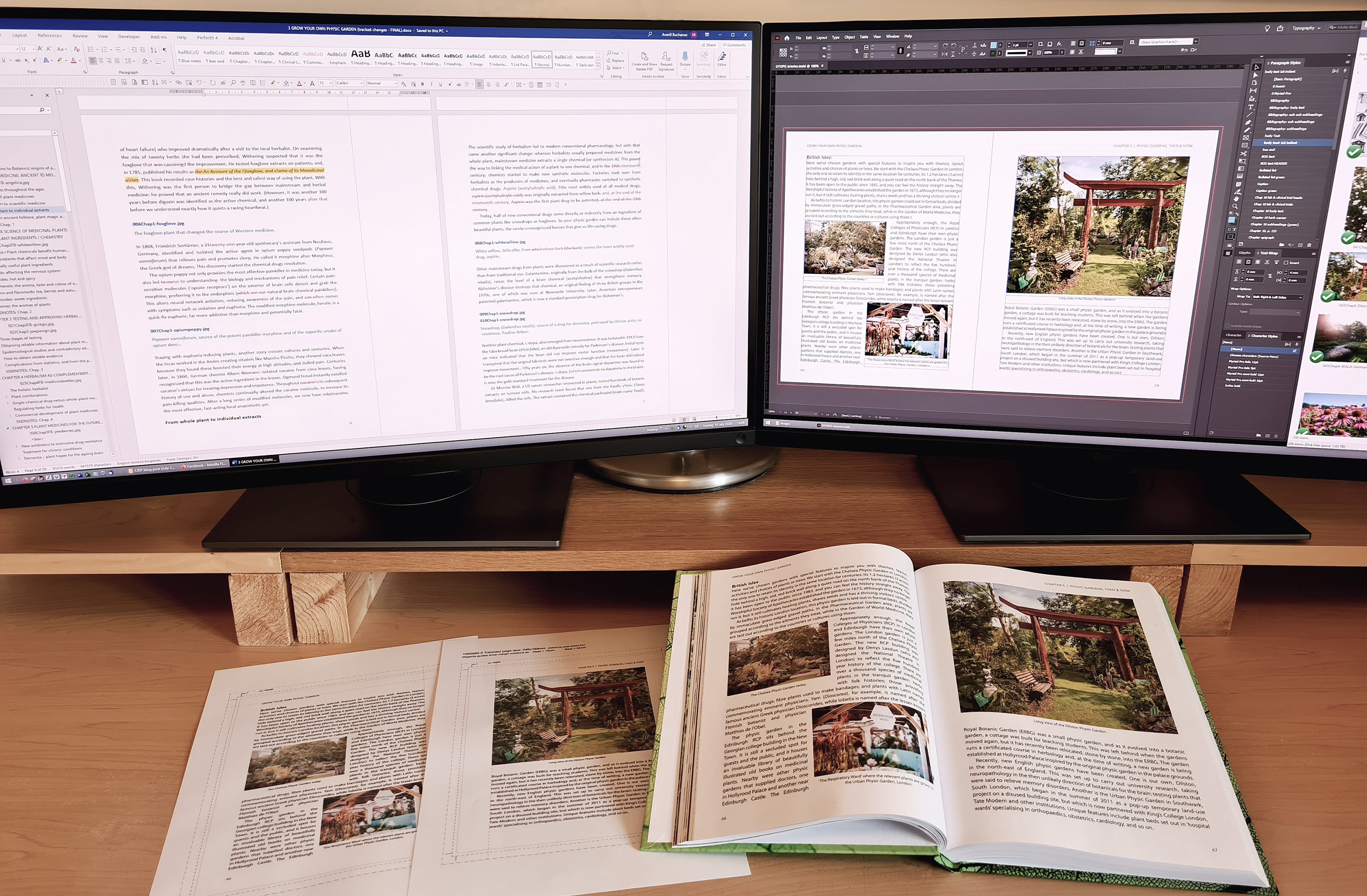
I’ve been working as an editor now for 14 years, specialising in fiction, but it isn’t the only aspect of the publishing process I can help with. I started my working life as a graphic artist, serving my time as an apprentice at a printers before moving on to run my own design consultancy. Twenty odd years later, the advent of self-publishing has drawn me back to my first career, and nowadays I also provide a range of book production services – typesetting and design for print, as well as ebook conversion.

Transferable skills

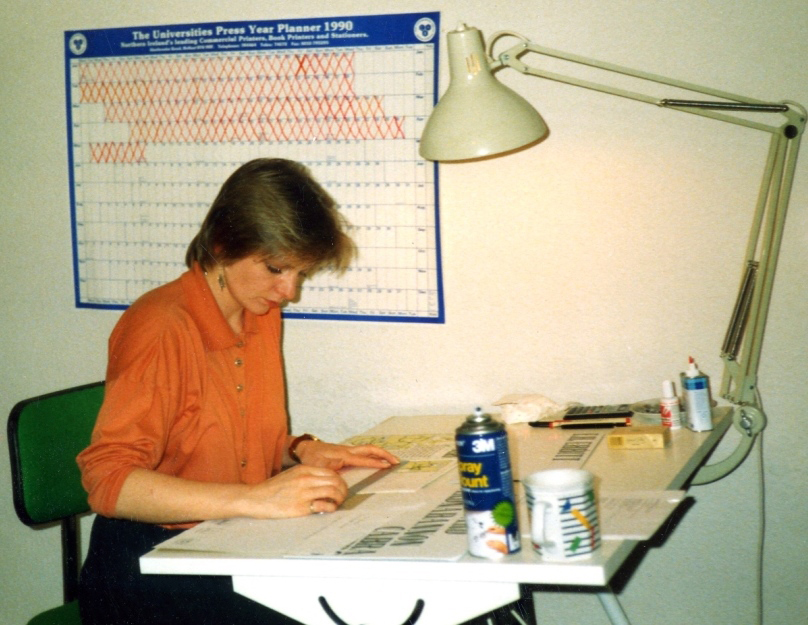
The graphic design industry has transformed since I left it in the mid 1990s to study English at university as a mature student. Computers and desktop design software have replaced Letraset and SprayMount, and designing for the web is a new area of expertise. But the thing about graphic design is that regardless of the tools you use, you never lose your aesthetic sensibilities, your feel for what works visually, or your tendency to volunteer an opinion of a book cover or logo even when you haven’t been asked. Once a graphic designer, always a graphic designer, I add by way of apology.

Me as a graphic designer in 1990

Self-publishing

I joined the editing profession at just the right time. Around 2009, technology was making self-publishing available and accessible to anyone who had a computer – no design ability required. It didn’t take me long to realise how useful I could be to many of my editing clients – self-publishing authors who just wanted to write but didn’t have the design nous or patience to teach themselves how to produce good-looking books.

When I first offered book layout services, I used Word to create the interior of books destined to be printed through CreateSpace, Amazon’s old Print-On-Demand (POD) service. But I’ve since taught myself to use professional design software, notably Adobe Creative Suite, and now do all my typesetting and layout work in InDesign. It was a steep learning curve, but well worth it. Among other things, InDesign gives you superb control of text, pagination and layout, and I’ve been able to progress from producing text-only novels to full-colour coffee table books.

I’ve also taught myself how to make ebooks, thanks to extensive on-the-job training in xml encoding and html during a stint as an academic research assistant. I use Jutoh software to convert well-formatted Word documents, with or without images, into epubs and mobis (Kindle’s proprietary ebook format).

I tend not to offer cover design unless the client is publishing for friends and family only or is on a very tight budget. I prefer to send clients with commercial aspirations to a professional cover designer. It’s quite a specialised field and I don’t have the Photoshop skills (yet!) to make covers that can compete with trade-published books.

Hand-holding

Many authors find the online world challenging and it seems a shame to allow that to get in the way of them pursuing their life-long dream. So in addition to actually making the books, I also offer a hand-holding service to shepherd nervous authors through the online publishing process.

For instance, using screen-sharing software, I can sit with the client online as they set up their Kindle Direct Publishing (KDP) account and upload their book(s), or I can record a short video of me doing it on their behalf, which I later email to them. Some authors just want it all done for them, leaving them to log in to their dashboards to check sales figures.

Publishing consultancy

As the self-publishing industry has matured and become more professional, the options available can be overwhelming for authors. I can explain things in layman’s terms and offer advice about the route to publication that best suits their needs.

It’s important to establish authors’ objectives at the outset – not everyone wants to be published to make money. Some have written memoirs that are only for family and friends; others want to raise awareness for charities. For many writers it’s simply a personal ambition to get a book published – they don’t want to make a career out of it. At the other end of the spectrum are authors determined to set up their own presses and be as professional and business-like as their budgets will allow.

I advise authors with little to no knowledge of publishing about things like buying ISBNs, setting up their own imprints, the differences between POD and litho printing, and the value of producing ebook editions. I can also help them cost it out. I don’t offer marketing as a service, but it needs to be factored in when offering advice about production. For example, if it’s important to an author that they see their book on the shelves of a high-street bookshop, they need to be aware of how difficult that is to achieve as a self-publisher. Or if an author’s ultimate goal is to give talks and handsell their book at events as well as online, they might want to consider getting, say, 100 copies printed at a printers, in addition to publishing via KDP. My aim is to help authors make the best decision for their circumstances, taking into account their goals and priorities, their budget and how they plan to market their book.

One-stop shop

While some authors prefer to build their own self-publishing teams, hiring different freelancers to handle each aspect of book production, others prefer to work with the same person from start to finish. It’s easier for them to manage the project this way, and as we develop a good working relationship, things go more smoothly. I alert authors to the pitfalls of having the same person edit AND proofread the text, and often, with their permission, I’ll outsource the proofreading. But if they prefer me to do it, for whatever reason, I’m somewhat reassured in the knowledge that other processes, like typesetting or layout further down the line, are another opportunity for me to see the text in a new way; any lingering typos or inconsistencies usually leap out at me later on.

When I quote for large projects that involve several steps, I break the work down into its discrete tasks and agree staged payments with the client in advance. Scope creep is almost inevitable in a big job; the important thing is to keep the author updated and informed of any increased costs.

Some of the books I’ve worked on recently

Book production uses a different part of my brain – I can listen to music while I do design work, whereas I need total silence when I’m editing or proofreading. I enjoy the variety of the work and getting to flex my design skills again. And, of course, there’s a great deal of satisfaction in seeing a publishing project through from the editing stage (sometimes even earlier) to the finished product. But the best reward of all is hearing from an excited author when they see their book for sale on Amazon or when they get to hold a copy in their hands at last.

Averill Buchanan is a recovering graphic designer and fiction editor. She is an Advanced Professional Member of CIEP, a Full Member of AFEPI Ireland and a Partner Member of the Alliance of Independent Authors (ALLi). She also runs her own publishing imprint, Herself Press, which aims to (re)publish the work of neglected women writers from the North of Ireland.


Over 170 Professional and Advanced Professional CIEP members offer ‘book production‘ as a service.


Proofread by Alice McBrearty, Entry-Level Member.
Posted by Abi Saffrey, CIEP blog coordinator.

The views expressed here do not necessarily reflect those of the CIEP.