Tag Archives: printing

Curriculum focus: The publishing process

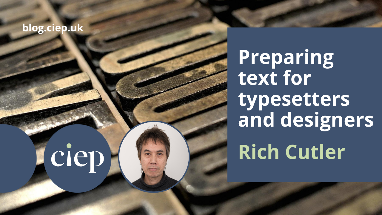
In this regular feature for The Edit, former training director Jane Moody highlights an area of the CIEP’s Curriculum for professional development. This month’s article is packed with useful information to expand your knowledge of the publishing process, from digital to bookbinding!

Publishing is covered in several areas of the curriculum. I haven’t included editorial processes in the list below, but rather concentrated on those aspects of publishing that are not covered by our core skills. These areas are valuable for a competent copyeditor or proofreader to know about. Most topics fall into Domain 2 Editorial knowledge and practice, but I have included one from Domain 1 Working as a professional.

KNOWLEDGE CRITERIAEDITORIAL COMPETENCIES, PROFESSIONAL SKILLS AND ATTITUDES
1.1.1 Role and responsibilities of an editor/proofreader within a publishing team• Understands publishing schedules and budgets, and how they interact
• Is aware of the responsibilities of an editor to stakeholders and of the editor as an intermediary
• Understands the place of an editor/proofreader in the publishing process
• Is aware of own role within the team and able to work as part of a team
2.1.1 Workflows• Understands the critical stages involved in any publishing process
• Understands common publishing terminology
2.1.2 Schedules and budgeting• Understands the importance of scheduling and budgeting within any publishing process
• Understands the influence of the schedule/budget on the scope of editing/proofreading
2.1.4 Production processes• Understands the roles and responsibilities of a production team
• Understands the meaning and use of common production terminology
• Understands the stages of the production process (eg prepress, print/electronic production)
2.1.5 Design, typography and typesetting• Understands the meaning and application of common typographical terminology
• Is aware of different fonts, typefaces and their uses
• Recognises typographical characteristics: measures, alignment, spacing
• Understands word and character spacing, leading, indentation, non-breaking spaces, hyphens
• Understands layout, typesetting and working with a typesetter (specification, layout, revises, running sheets)
2.1.6 Printing and finishing• Understands the requirements for different printing processes (colour, paper types, sizes, file sizes, resolution)
• Is aware of different printing processes (eg litho, offset, digital, print-on-demand)
• Is aware of different print finishes (eg sealer, varnishes, laminates)
• Is aware of different binding methods (saddle-stitched, perfect binding, sewn, case binding, self-cover)
2.1.7 eBook formats• Is aware of different ebook formats (eg EPUB, Amazon AZW, PDF, TXT, MOBI
• Has a basic understanding of which format to choose in different situations
2.1.11 Different models of publishing• Is aware of the different types of publishing models (eg traditional publishing, businesses and other clients, self-publishing)
• Understands the different financial models of publishing (eg traditional publisher pays, author pays, open access, hybrid models, self-publishing)

Terminology

Before you can understand the processes, perhaps you might need some explanation of the many jargon terms used in the business. You can, of course, use the CIEP Glossary. Other terms might be found in HarperCollins’ Glossary of Book Publishing Terms. For a lighter look at publishing terms, try Tom’s Glossary of Publishing Terms (in which the term copyediting is defined as ‘A phase of publishing that requires little or no budget, is considered of slight importance, and may be omitted at the option of the publisher’, copyright as ‘A concept invented by lawyers as a hedge against unemployment’, and chapter-by-chapter breakdown as ‘the progressive deterioration of a copyeditor who is on a tight deadline’!)

Some slightly more technical terms can be found in Desktop Publishing Terminology – The Complete Guide (2022) from Kwintessential.

Process and workflow

Understanding the publishing process is essential for copyeditors and proofreaders. However, understanding is complicated because there is no one process – workflows vary from publisher to publisher and with different types of publishing. There are several CIEP courses listed in the curriculum and other helpful resources. The CIEP fact sheet The publishing workflow is a good starting point.

Courses are thin on the ground, but the Publishing Training Centre runs an e-learning module An Introduction to publishing, which is described as being for ‘newcomers to publishing who wish to gain a grounding in the structure of the publishing industry today, along with its key processes and functions’.

Books include:

  • Inside Book Publishing, 6th edn by Giles Clark and Angus Phillips (Routledge, 2019), ‘the classic introduction to the book publishing industry’.
  • Handbook for Academic Authors: How to Navigate the Publishing Process, 6th edn by Beth Luey (Cambridge University Press, 2022).

Here, I’m looking further to find information in the online environment:

  • The Publishers Association is a good source of information. Their webpage ‘How publishing works’ gives detailed information and includes personal accounts of working in the role (although when I looked, there were several broken links).
  • Publishing Talk aims to help new and emerging authors write, publish and sell books. Jon Reed has written a blog, ‘The book publishing process – an 8-step guide’.
  • Individual publishers may offer guidance to authors about their particular processes, which can also be useful to editors, particularly if they include timings. See, for example, the Bloomsbury guide to the publishing process. The timings quoted there might raise a few eyebrows! HarperCollins personalises the process, with individuals describing their roles in the company.
  • Bill Swainson has written a blog, ‘The Publishing Process’ (originally written 27 July 2012 and updated 20 January 2021), for the Bloomsbury Writers & Artists newsletter.

close-up of a printing machine

For a different kind of publishing process for non-fiction, read the IntechOpen article ‘Publishing Process Steps and Descriptions’. IntechOpen is an open-access publisher. This model of publishing charges a fee to the author or the author’s institution (£850 per chapter) and the subsequent (online) publication is made freely available to readers.

ALLi provides information on the self-publishing process in a blog by Orna Ross, ALLi Director: ‘What Is Publishing? The Seven Processes of Book Publishing’. Also describing the self-publishing process is a guide from the Writers’ Guild, published in 2022, Self-publishing: A step-by-step guide for authors.

Other web resources include an ‘Academic Publishing Toolkit’ for potential authors from the University of Manchester Library. The University of Manchester Library has a number of helpful webpages on the publishing process. ‘The publishing process – what to expect’ includes flowcharts for each type of publication. These webpages give information about typical stages, milestones and timescales that you’re likely to encounter when publishing a journal article or a monograph. 

What all these useful articles don’t say, in their attempts to set out a clear process, is that some (sometimes all) these processes can happen in different orders, or all at once. Often, the design is adapted from a previous publication, so is already set before the editorial processes start. Sometimes publication is driven by the market, and marketing may be started before a word is written or edited. Publishers’ marketing departments are often over-enthusiastic about the speed of production of their forthcoming titles! How often have you ordered an advertised book only to be told (often several times) that the publication date has been put back?

Ebooks

Anum Hussain’s blog post ‘How to Create an Ebook From Start to Finish’ (11 August 2022) is a useful introduction, as is ‘How to Make an Ebook in 5 Steps Without Breaking a Sweat’ from Designrr.

Everything Self-Publishers Need to Know About Ebook Formats’ (8 November 2021) gives a run-down of the different formats available and when (and how not) to use them.

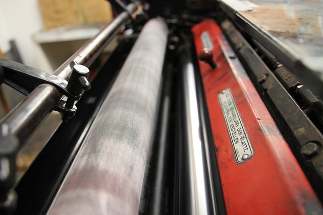
Printing and binding

You can read about the printing and binding processes, but it is hard to imagine what it’s really like without seeing it. YouTube is a happy hunting ground for videos – once you start to look, you will find many helpful videos that explain the process or just give you a feel for what it is like. Here are just a few.

If you don’t know much about the printing process, watch Gorham Print’s YouTube video, which shows the process in a small printing company. Watch the same basic process on a giant scale in a Korean company, Mega Process (or this one: Factory Monster). I can tell you from personal experience that these factories really are that noisy, even without the music! This clip is more explanatory: ‘How It’s Made Books’. I’d recommend watching them both: the Korean ones will give you a better feel for the real action, but the explanations in the latter are very helpful.

For a slightly different approach, watch Amazon Books’ ‘make on demand’ process. The sound quality is occasionally quite poor, which is a shame, but it’s worth watching to see the POD (print-on-demand) process.

Newspaper printing is quite specialised. Watch the New York Times (in 2019) or The Times (in 2022) being printed.

Offset litho printing is described in a video from Solopress and the sheetfed system in one from Sappi (this one has subtitles). Express Cards’ simple animations make the whole process a lot easier to understand.

Digital printing is explained in a video from Sappi and from Sticker Mountain (Indigo printing).

The Telegraph has a video from 2012: ‘Birth of a Book: how a hardback book is made’ – there will still be companies in existence who use the human touch, but probably not many like this one. For an even more esoteric skill set, watch ‘The Chelsea Bindery Show the Processes of Book Binding’ – once upon a time, most books were bound like this. It’s more like this now: ‘Book binding (Muller Martini Monostar)’.

About Jane Moody

Jane has worked with books for all her working life (which is rather more years than she cares to admit), having started life as a librarian. She started a freelance editing business while at home with her two children, which she maintained for 15 years before going back into full-time employment as head of publishing for a medical Royal College.

Now retired, she has resurrected her editorial business, but has less time for work these days as she spends much time with her four grandchildren and in her garden.


About the CIEP

The Chartered Institute of Editing and Proofreading (CIEP) is a non-profit body promoting excellence in English language editing. We set and demonstrate editorial standards, and we are a community, training hub and support network for editorial professionals – the people who work to make text accurate, clear and fit for purpose.
Find out more about:


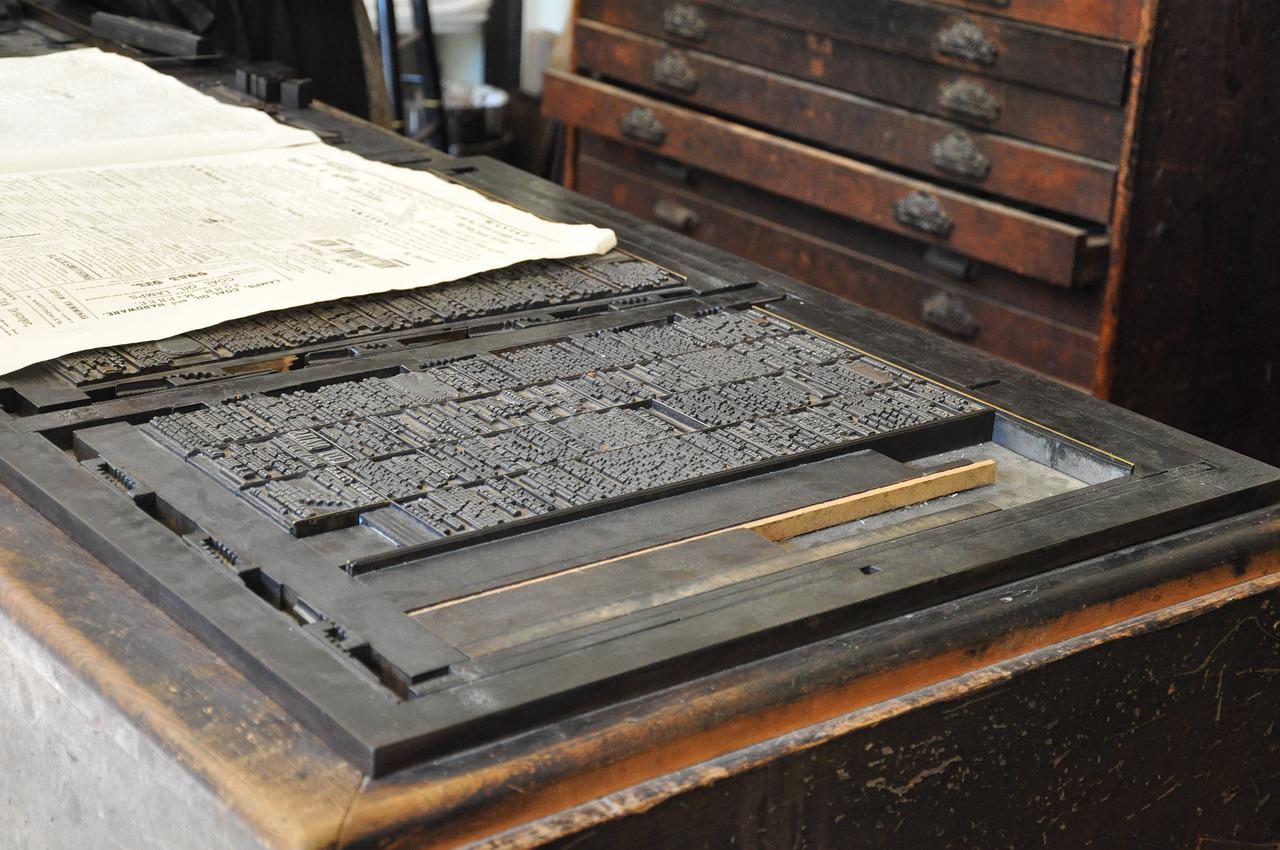
Photo credits: letterpress by Jirreaux; printing machine by Dengmert; both on Pixabay.

Posted by Sue McLoughlin, blog assistant.

The views expressed here do not necessarily reflect those of the CIEP.

Preparing text for typesetters and designers

What’s the difference between a typesetter and a designer, and why does it matter? How should copyeditors prepare text for typesetting? In this post, Rich Cutler gives us a brief introduction to the world of typesetting and design.

The first thing to realise is that copyediting is a game of two halves: editing the content (language, style, fact-checking, consistency …) and preparing the copy for the publication process. Although modern copyediting has changed significantly this century, the latter task (copy preparation) remains vital for most published texts.

Second, copyeditors need to know that a typesetter and a designer are different beasts: ‘typesetter’ and ‘designer’ are not synonyms, though some designers can typeset, and some typesetters can design. The copyeditor should ask their client whether the copy will be going to a designer or a typesetter.

It helps to know the background and evolution of typesetting and design when preparing copy. The two professions are often lumped together but in actuality are very distinct and require different approaches by copyeditors.

A brief history of typesetting

The origins of typesetting lie in printing. Gutenberg’s printing press revolutionised book making in the 15th century by its use of movable and replaceable metal type, which allowed books for the first time to be made quickly and as multiple copies – previously, books were mostly painstakingly handwritten. Early printing houses employed people who arranged or ‘set’ these individual metal characters as words, lines, paragraphs and, finally, pages, ready to print on sheets of paper: these were compositors, later called typesetters.

Typesetting centres on two key principles: aesthetics and readability. A typesetter will arrange text and displayed material (such as illustrations and tables) on a page so that the eye is led naturally from one idea to the next, making sure that the context is conveyed at a glance through careful placement of the elements on a page (eg headings and line and paragraph breaks).

Typesetters are problem-solvers. The ideal layout is not always possible – the perfect placement of, say, an illustration in relation to the design and the sense of the text may result in unacceptable positioning of subsequent material – so compromises are needed to achieve a balance between readability and aesthetics. Authors, clients and proofreaders may grumble about the less-than-ideal location of a figure, but an experienced typesetter will have sound reasons for its placement.

Typesetting has always been a highly technical profession. During Gutenberg’s time and into the 20th century, pages were composed as mirror images of the printed pages by placing metal type with reversed characters in backwards order into a frame. Hot metal typesetting was replaced by a photographic technique – phototypesetting – in the mid-20th century, and a record of the text composed by the typesetter was stored as perforated paper tape. Typesetters were so skilful that they could interpret the patterns of punched holes in the tape as typographical characters and layout. Phototypesetting machines in the 1970s replaced this paper record with magnetic tape, but were yet to have screens allowing the typesetter to see what they were composing.

Preparing copy for a typesetter

Today, typesetting, like many professions, is done using computers and specialist typesetting software costing several thousands of pounds (the best known being Arbortext). The historically highly technical nature of typesetting is visible in Arbortext and its ilk, which focus on showing the operator the content of a page on screen rather than its actual appearance (see the screenshot) – headings, paragraphs, lists, etc, have arbitrary styles that simply differentiate these items from each other and bear no relationship to how they will appear in print (not unlike Microsoft Word in the early 1980s – before Windows existed!). All text items are assigned tags in a computer language (typically XML) that defines what the elements are – and a master definition file dictates what should be done with these elements, such as their appearance in print and online (which may differ), and whether certain elements are to be hidden in some versions (eg for particular markets).

Typesetters are therefore very computer literate, and are familiar with Microsoft Word, computer code, styles, tags, macros and so on.

So, if a copyeditor provides a typesetter with tagged text, a Word file using styles or even a Word file using local formatting rather than styles, the typesetter should have no difficulty producing proofs with the required layout and appearance.

If the copyeditor wants to make the typesetter very happy – and to reduce proof errors – the copyeditor should

  • remove all unwanted formatting and styles that have been applied to the text
  • use a tagging or styles scheme only (or perhaps a combination) to indicate appearance
  • provide a key to their scheme.

Additionally, the copyeditor should flag anything out of the ordinary or requiring a specific layout or appearance (unusual characters, alignment and indents in, say, a poem, illustrations that must appear together, etc). Using local formatting to indicate the appearance and layout of text for typesetting is not ideal because this unsystematic approach can be ambiguous and unclear.

How designers differ from typesetters

Adobe InDesign hasn’t yet been mentioned. It is a graphic design program, not a typesetting program. Although it can be used for typesetting, it is slow and inefficient compared with dedicated typesetting software like Arbortext. InDesign is aimed primarily at graphic designers: in particular, a breed of designer that appeared alongside phototypesetting.

A phototypesetting machine produced photographic paper with an image of text. This could be an entire laid-out page, which was used to make a printing plate. However, the pages of complex publications like magazines or newspapers were easier to create by typesetting blocks of unlaid text, cutting up this text and gluing it (along with illustrations) to a sheet of card. These hand-made pages were then sent to the printer. Graphic designers who did this job were called paste-up artists: they were skilled designers, but did not have the technical focus on type that defined typesetters.

The widespread adoption of computers in the 1980s led to the appearance of desktop publishing (DTP) software aimed at graphic designers working in publishing. DTP software was affordable and easy to use compared with typesetting software, and allowed designers to typeset publications themselves for the first time. The best-known DTP program today is Adobe InDesign.

DTP changed commercial typesetting forever – and divided typesetters into camps:

  • those whose lineage is printing
  • those with a graphic design background.

To better understand how designers approach page layout compared with typesetters, we need to know a bit about DTP programs: they are the digital equivalent of paste-up – text and illustrations are placed in frames, which can be resized and moved about a page; also, a page will print exactly the same as it appears on screen (not unlike today’s Microsoft Word). A designer’s focus is primarily on aesthetics and appearance, and not so much on the structure and function of text like a typesetter. Most designers therefore have a less technical approach to typesetting, and may not use or understand tags or Word styles – many prefer to copy and paste text into InDesign, to deliberately lose all styles and formatting, then manually reapply styles and formatting in InDesign.

All typesetters work in a similar way, but the same cannot be said for designers: the copyeditor needs to find out how the designer wants text prepared. Some designers may be happy with a tagging or styles scheme, others prefer to copy and paste and then manually apply formatting. Some designers doing the latter may be efficient at spotting and transferring formatting, others may be more hit and miss, so highlighting formatting such as italics and superscripts for them can help.

About Rich Cutler

Rich Cutler began in publishing as a desk editor for STM publishers – first at Pergamon Press, then Harcourt Brace Jovanovich. He later became a freelancer and co-owner of Helius – a business that has been providing bespoke services to publishers for three decades, including development editing, copyediting, proofreading, project management, illustration, graphic design and typesetting. Rich is an Advanced Professional Member of the CIEP. He is also an occasional lexicographer, and helped to write the Collins English Dictionary and the Oxford Dictionary for Scientific Writers and Editors.


About the CIEP

The Chartered Institute of Editing and Proofreading (CIEP) is a non-profit body promoting excellence in English language editing. We set and demonstrate editorial standards, and we are a community, training hub and support network for editorial professionals – the people who work to make text accurate, clear and fit for purpose.

Find out more about:


Photo credits: letters by Jirreaux, printing press by Mari77, both on Pixabay, Arbortext by Rich Cutler.

Posted by Harriet Power, CIEP information commissioning editor.

The views expressed here do not necessarily reflect those of the CIEP.

Crafty editors: Part 2

Earlier in July, we shared Part 1 of our crafty editors series – here are some more delicate, striking and tasty examples of what our members do with their spare time!

Jenny Papworth

This is a set of four prints on the theme of ‘winter’. I started screen-printing after a course at the local arts college, and I now print on paper and textiles and sell through my shop on Etsy. Doing something crafty is a great way to wind down after a long day in front of the computer, and screen-printing offers a whole new arena in which to be precise and pedantic.

John Ingamells

Lockdown inspired many people to try baking sourdough bread. But the method’s popularity has been on the rise (!) for some years. Of course, sourdough is nothing new; it is the way bread was made for thousands of years before we learned how to make yeast separately.

Its devotees are captivated by the strange alchemy: the bread-and-water starter that lives in the fridge for years; the process that turns three simple ingredients – flour, water and salt – into well risen bread with a depth and complexity of flavour that mass-produced breads cannot match. And, to add a genuinely modern twist, they now tell us it’s actually very good for us as well!

Sam Hartburn

Here are some modular origami dodecahedra I made – the first is a normal dodecahedron made from post-it notes; the second is a stellated dodecahedron. I’m not sure if the third has a name – a flowered, cubed dodecahedron maybe.

In modular origami, you fold a number of identical modules from small pieces of paper, then fit them together into a bigger shape. The modules usually slot together and stay in place without any glue, although often there is no strength to the piece until the final module is slotted into place – meaning that the process of putting them together can be frustrating. You can even make origami pieces that move, like this rotating structure.

Rich Cutler

A few years ago I became interested in art and photography. Like most budding photographers I started out by taking decorative, pleasing images. However, I soon became dissatisfied with these, and found myself drawn instead to contemporary art – about which I knew very little (my background is in science). On a whim I applied for a master’s degree in photography, and to my surprise I was accepted! Doing the MA was one of the best decisions I’ve made, and improved my photography immeasurably. Since graduating in 2013 I’ve exhibited as a photographic artist both in the UK and internationally.

Rich has managed to show his work publicly despite the lockdown: Insecta in the window of the contemporary art gallery Fabrica, Brighton (on display until September).

Annette Doutney

I arrange flowers at my parish church and it’s something I have missed during lockdown. It’s both relaxing and satisfying to take beautiful things and create something even more beautiful with them in a peaceful, empty church. I can let my mind wander as I work, too, unlike when I am editing or proofreading!

Philippa Tomlinson

Wet felting is surprisingly hard physical work when done by hand, but this is partly why I love it. It is also a sensory activity – so a welcome antidote to the sometimes stressful hours spent staring at the computer screen. I can let my mind drift off, immersed in the colours and smells and textures of the felting while listening to music or the sounds of nature outside in the garden. It is also an unpredictable craft – you are never quite in control of how the final product will turn out – and it’s good to learn to embrace that.


Proofread by Joanne Heath, Professional Member.

Stitched together and posted by Abi Saffrey, CIEP blog coordinator.

The views expressed here do not necessarily reflect those of the CIEP.

Crafty editors: Part 1

On the CIEP forums, we recently asked members if they’d like to share their crafting skills, and had a fabulous response – this is Part 1 of our crafty editors series!

Sarah Perkins

Here is Pugin, my firescreen.

I saw a beautiful glass peacock firescreen. I loved it, but it was far too small and delicate for my fireplace, and very expensive. It got me thinking that I could make something three dimensional, so I didn’t need the traditional frame to make it stand upright. Apart from the peacock blue felt, he was made from various scraps, in different techniques so I didn’t get bored or run out of a material I couldn’t find again. There’s knitting, patchwork, quilting, drawn thread work, crewel embroidery, ribbon weaving, needle lace, felting, machine embroidery, and even a bit of fair trade raffia.  You wouldn’t believe how many people have asked me why I don’t call him Penelope. Because he is a peacock. Ah!

Catherine Dunn

I studied fine art at Loughborough University and graduated in 2001 with a BA in painting. Since then, I’ve continued to draw and paint as a hobby. I find it helps me zone out and relax. Due to space constraints, these days I keep it fairly small. This piece is in watercolour pencils and ink. I enjoy working in a wide range of media, but I always keep things mainly in two dimensions. I’ve recently started experimenting with ProCreate Pocket on my iPhone, which is opening up new avenues to me.

Joanna Porter

I make lace, mainly bookmarks because they are relatively simple to do and still work even if the lace is not 100% perfect. I find it therapeutic as it is not that complicated to do but does require total concentration. Part of the pleasure also comes from using my grandmother’s bobbins. I hope to add a lace bookmark to the raffle at the 2021 CIEP conference.

Elaine Monaghan

Silk satin; pre-print dip in logwood dyebath; bramble, oak and coreopsis

I enjoy making botanical contact prints (sometimes known as ecoprints), mostly using leaves from my garden, or collected while on a walk. It’s a very personal way of making a permanent record of a moment in time. I generally print on protein fibres (silk, wool), which take prints well; cellulose fibres (cotton, linen, bamboo, etc.), including paper, can be trickier. The photos show two examples of printing on silk. The technique has great potential for upcycling favourite old garments that need a new look, and I’m working on incorporating prints into conventional garments (such as on a silk lining for a jacket).

Habotai silk; sumach and oxeye daisy; post-print dip in madder dyebath

One of the attractions of the technique is that each print is unique: the result of printing a leaf from an individual tree may vary, depending upon the season, and if weather conditions change. It’s encouraging that even the most experienced printers get unexpected results!


Caroline Petherick

After a rather long break, I took up knitting again and kicked off with a nice warm woolly for winter.


Paul Sensecall

In my spare time, I produce abstract works on canvas using natural coloured mica pigments mixed with resin and hardener. The resin sets to a hard clear vitreous finish, giving interesting light-diffracting qualities to the pigments on the canvas. I use a mixture of techniques to add and disperse the pigments and resin across the canvas and to introduce cells and lacing effects.


Proofread by Joanne Heath, Professional Member.

Stitched together and posted by Abi Saffrey, CIEP blog coordinator.

The views expressed here do not necessarily reflect those of the CIEP.