This month The Edit welcomes a new regular columnist for A finer point. In his first outing, Dan Beardshaw addresses an editor’s favourite: apostrophe position, here in relation to possessive generic nouns.

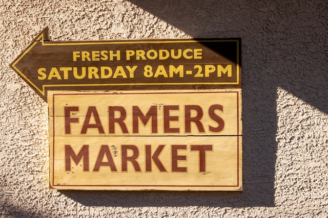
A common debate around apostrophe use involves the correct placement in a compound like farmer’s market or for products you might buy at one, such as hen’s eggs, cow’s milk or goat’s cheese. Shouldn’t it be plural farmers’ as there is surely more than one farmer there? And likewise, plural hens’, cows’ or goats’ to reflect the plurality of animals involved in production? Why not ditch the possessive altogether as we do for, say, duck eggs? Or is the singular possessive correct, serving here to indicate a category rather than the numbers involved? The case for the singular possessive is perhaps the most abstract, involving a specific use of the generic noun, and in this post I will explore its wider use in comparison with the plural (and other forms) and how best to approach the point in style decisions.
What are generic nouns?
Nouns can be split into two main groups: proper nouns, which are the names we give to individual people, animals, places, buildings, organisations and so on; and common nouns, which identify the general category something belongs to. But common nouns have their own distinctions, too. For example, in the sentence I’m going to feed the hens, the common noun hens refers to a specific group of hens – they are the speaker’s hens. Sometimes, however, we want to talk about a category in a broader sense: enter the generic noun. Generic nouns are a type of common noun but have the unique sense of referring to a person, place or thing universally.
Singular, plural and mass generic nouns
Generic nouns most often appear in either a mass or plural form.
Coffee is addictive. (mass)
Cats are cute. (plural)
A mass noun is sometimes used as a generic counterpart to its countable non-generic form.
‘How many pizzas shall we order?’
Pizza is the most popular takeaway.
Generic nouns can appear in singular form with a definite article (the).
Green tea is good for the brain.
I play the guitar.
We also see singular generic nouns with an indefinite article (a/an). This type may be used as part of an enquiry and its corresponding explanation.
Q: What’s an Oxford comma?
A: An Oxford comma is a listing comma worshipped by many, denounced by others and neither here nor there for the rest of us.
Possessive generic nouns
The singular generic noun with an indefinite article also often appears in idiomatic phrases as a possessive. In these possessives, the meaning of the indefinite article is ‘any’ or ‘all’ rather than ‘one’.
‘You’ve made a dog’s dinner of that.’
Looking for a one-size-fits-all rule is usually a fool’s errand.
We may find the singular possessive in the names of certain shops, such as newsagent’s, barber’s shop and greengrocer’s (not to be confused with the issue of the ‘greengrocer’s apostrophe’, which refers to erroneous plural formations such as potato’s instead of potatoes). This use can be seen as having an attributive function, assigning a category to the establishment in question, even though shop, store or whatever is frequently omitted in abbreviation. We could paraphrase the sense with an alternative singular generic form as, for example:
A shop selling the goods typically provided by a newsagent.
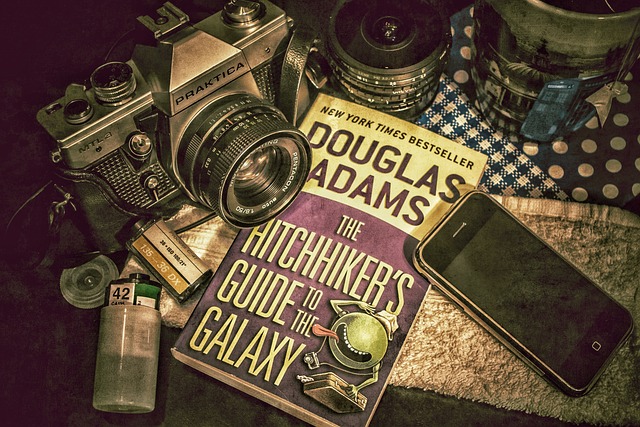
Another use can be found in book titles such as The Hitchhiker’s Guide to the Galaxy and The Complete Idiot’s Guide to … series. In some cases, singular and plural generic possessives may be more or less interchangeable, but that doesn’t seem to be true here. The plural alternatives The Hitchhikers’ Guide and The Complete Idiots’ Guide both suggest a non-generic sense by using a definite article (the) with the plural – they appear to be referring to a specific group of hitchhikers or idiots in the same way that I’m going to feed the hens refers to a specific group of hens. But, as detailed in the previous section, there is an established generic form that uses a definite article with a singular noun, making the singular a logical choice for the possessive in this sort of context.
A similar case can be made for the singular form in compounds like cow’s milk as a generic equivalent to one or other of the senses outlined so far – perhaps closest in paraphrase to something like milk of the cow. So if a client’s preference is for the singular possessive and the style is used consistently, there might not be a good basis for changing it beyond any decisions they may have made to align with a particular style guide – more on this in the section ‘Style guide coverage’ below. However, this is also an area where convention may determine the decision. For example, clothes shops typically name their departments with a plural possessive: women’s clothes/men’s clothes/children’s clothes. The same case for the singular in other instances could arguably be made here, but the plural convention is so ubiquitous that the singular would read awkwardly for most people.
Generic possessives without an apostrophe
As Cathy Tingle has written about in her column ‘Disappearing apostrophes’, it’s quite common to find examples of what appear to be possessive compounds that have formally discarded the apostrophe. While this variation is more likely to appear within proper nouns, many institutions use a possessive generic noun as part of their title. Compare, for example, Musicians’ Union with The Communication Workers Union. Dropping the apostrophe from Communication Workers technically turns the word from a possessive into an attributive, and it’s possible this was the intention of the copy writer. However, names of organisations that include a generic noun indicating the group’s intended membership have an implicit possessive sense. It should be anticipated that some readers may parse them in this way, so consideration of the form of the generic noun is a factor if a decision of this type comes up. At the same time, the lack of an apostrophe is unlikely to cause serious ambiguity here – if it did, it would have been less likely to establish itself as a style choice.
Style guide coverage
A range of approaches to some of the points explored in this post appear in published style guides.
Fowler’s (Oxford University Press, 2015) takes a fairly liberal position on possessives without apostrophes in titles, including those which use a generic noun for the possessive/attributive part of the name (in their examples, Citizens, Diners, Farmers, Mothers and Teachers).
Relinquishment of the apostrophe. Since about 1900, many business firms, institutions, and journals have abandoned apostrophes in their titles, e.g. Barclays Bank, Citizens Advice Bureau, Diners Club, Farmers Weekly, Harrods, Mothers Pride Bread, — Teachers Training College.
Though occasionally disapproved of, the practice can be justified as an attributive rather than possessive use of the noun (i.e. Barclays Bank is attributive, implying association with Barclays, whereas Barclay’s Bank is possessive, implying ownership by people called Barclay).[…]
This trend towards the dropping of the apostrophe […] in such names and titles seems certain to continue. (Fowler’s, p59)
In contrast, The Chicago Manual of Style (CMOS) actively recommends avoiding the attributive style in favour of keeping the apostrophe in all cases unless referencing an existing proper noun that has already adopted the style. It also favours the plural possessive.
Although terms denoting group ownership or participation sometimes appear without an apostrophe (i.e., as an attributive rather than a possessive noun), Chicago dispenses with the apostrophe only in proper names (often corporate names) that do not officially include one. In a few established cases, a singular noun can be used attributively; if in doubt, choose the plural possessive. (CMOS 7.27)
And, to return to the agricultural theme, Ben Dreyer addresses the topic by way of farmers markets and resolutely backs the apostrophe-less form.
-
- Is it ‘farmer’s market’ or ‘farmers’ market’ or ‘farmers market’?
- I’m presuming there’s more than one farmer, so out goes ‘farmer’s market’.
As to the other two, is it a market belonging to farmers or a market made up of farmers?
I say the latter, so:
farmers market (Dreyer’s English, p42)
In conclusion
Text confounded by chaotic style choices such as a sentence that suggests buying hen’s eggs, cows’ milk and goat cheese at the farmers market can be made consistent in at least three logically justifiable ways. But keep an eye on usage conventions: throw duck eggs into that mix and you’ll either be swimming against the tide of popular preference or aligning with it to produce the awkward result of farmer market. A text might well present a constellation of instances for which absolute consistency confounds absolutely. So should a decision of this kind arrive at your desk, consider adding it to the ‘it depends’ column in the first instance.
Resources
Butterfield, J (ed.) (2015). Fowler’s Dictionary of Modern English Usage. Oxford University Press.
Chicago Manual of Style (2017). 17th edition. University of Chicago Press. Online edition. https://www.chicagomanualofstyle.org/book/ed17/part2/ch07/psec027.html
Dreyer, B (2019). Dreyer’s English. Century.
Tingle, C (2022). Disappearing apostrophes. CIEP Blog. https://blog.ciep.uk/apostrophes/
About Dan Beardshaw

Dan Beardshaw is a development editor, copyeditor and proofreader, specialising in ELT and education publishing. He is an Advanced Professional Member of the CIEP.
 About the CIEP
The Chartered Institute of Editing and Proofreading (CIEP) is a non-profit body promoting excellence in English language editing. We set and demonstrate editorial standards, and we are a community, training hub and support network for editorial professionals – the people who work to make text accurate, clear and fit for purpose.
Find out more about:
Photo credits: header image by Peggychoucair on Pixabay, Hitchhiker’s Guide to the Galaxy book by brenkee on Pixabay, farmers market sign by Count Chris on Pexels
Posted by Eleanor Smith, blog assistant.
The views expressed here do not necessarily reflect those of the CIEP.


![Screenshot showing the following five pieces of text each separated by a short vertical line: EM dash and EN dash; Navratilova with and without accents; amongst and among (highlighted yellow); Parliamentarians and ^& (highlighted green); ~[A-Za-z0-9]^13 and ^& (highlighted blue).](https://blog.ciep.uk/wp-content/uploads/2022/11/macros-1.jpg)